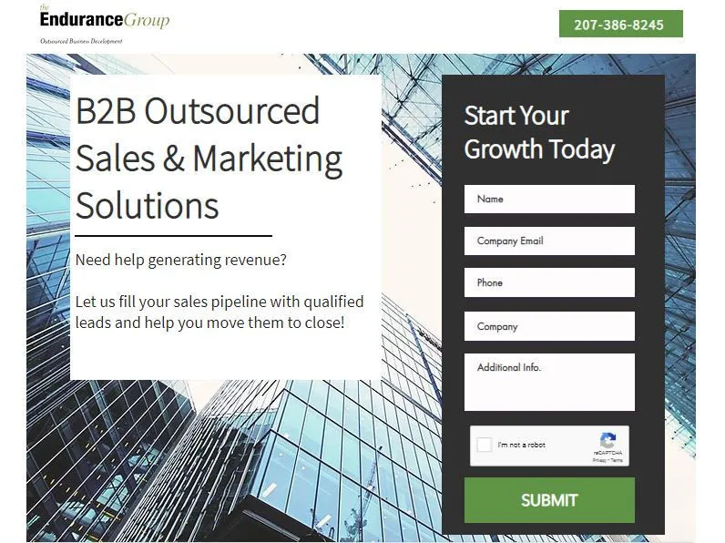
What is a Landing Page?
A landing page is a standalone web page specifically made for a marketing campaign. It is a one Call-to-Action (CTA) page that offers a consultation, product or service in exchange for someone’s information.

So what’s the difference between a website and a landing page?
A website is more of a robust home base where users/visitors can find a variety of information about your company and/or accomplished tasks. Landing pages are tightly focused and have one goal in mind – to push a visitor into a customer or client.
Take Shopify for example. They are a company that offers an e-commerce website platform for online stores and retail systems. Below is an example of their website and landing page. Although their landing page has the same offer – “free trial,” the website is more lengthy, has a navigational menu and several CTA’s for the visitor to choose from, whereas the landing page has only one CTA and is concise.
Website

vs. Landing Page

A website is indexed by Google and can be found through several points of traffic such as direct, social, organic, etc. whereas a landing page, although indexed/good for SEO as well…it is specifically driven from a marketing campaign/objective. In this Shopify instance, the landing page is driven by this Google Ad.
Benefits of Effective Landing pages
Landing pages are important because they increase your conversions in the most optimized way possible. It gives an opportunity to isolate and track the success of a particular goal you are trying to achieve. This is essential to expanding your customer base.
How to Create a Landing Page that Converts – 5 Tips:
1. Have a Good Value Proposition
- You’ll need to answer these questions, “Why should my visitor care about it?” , “What benefits can you offer?”, “What problems are you solving them?”
- The value proposition should clearly be stated in the header – If you can’t catch their attention in the headline, you will loose them!
- Convince people to read the rest of your page – make it concise having Ideally 7-8 words

2. KISS – Keep it Simple Silly
- Don’t overcomplicate it – remove the fluff
- The content should be concise – get to the point
- A lengthy page looses value and your audience will likely drop off if they are overwhelmed by repetition or unnecessary content

3. Show Social Proof & Credibility
- Showcase your work, provide case studies, show your customers/clients, partners, testimonials, etc.
- Win your audience over by gaining trust and proving that you are the expert!

4. Make it Visually Pleasing
- Have a visual focus – a product shot, service shot, video, etc.
- Videos are are highly effective so long as they are under a minute long – explain your offer in 30-60 seconds
- If you only have content, you will find your conversions will not be as promising – people like pretty things!

5. Test! Test! & Test Again!
- Don’t just stop at one- once you test it, create another to split test with – this is called A/B testing
- Understand how people operate with it – by creating more than one, you can identify user behavior and see which one performs best
- When it comes to A/B testing, a small edit can make a huge impact

Landing pages should accompany every promotion or marketing campaign that you build-out. If you need help creating one that you know will convert, contact us today.

